Being highly professional, many data scientists strive toward the best results possible from a practical perspective. However, let’s face it, in many cases, nobody cares about the neat and elegant models you’ve built. In these cases, fast deployment is pivotal for the adoption of your work — especially if you’re the only one who’s aware of the problem you’re trying to solve.
This is exactly the situation in which I recently found myself. I had the opportunity to touch an unutilized source of complex data, but I knew that I only had a limited time to demonstrate the utility of this data source. While working, I realized it’s not enough that people KNOW about the solution, I had to make sure that people would NEED it. That is why I sacrificed modeling accuracy to create the simplest solution possible. I also had to create a RESTful API server, a visualization layer, and a Slack notification system. As a result, the proposed solution, despite being oversimplified, is being gradually adopted across Automattic.
This post describes anomaly detection in time series. However, it is not about time series modeling, but rather about product development. This story, told in chronological order, is based on actual events, but I bend the historical truth in favor of the better story. I hope you’ll enjoy.
In deep trouble (?)
You might know that Automattic is a distributed company, meaning that everyone works from wherever they prefer. Currently, the data science team is spread across four continents. From time to time, we meet in person. One such meeting took place in Berlin, Germany. During that meeting, Carly, the lead of the data science team, told us that Automattic CFO, Stuart West, asked us to apply some data science magic to the company’s financial information. It turns out that despite the fact that all the financial data is available through an internal dashboard site, almost no real‑time analytics were performed on that data.

The most obvious way to find value in such a data source is to deploy an anomaly detection system. Such a system would monitor our company’s money and alert us in cases where something unusual happens. If you have ever analyzed time series, you might know that this is a complex problem. However, to the surprise of my teammates, I proclaimed that in our case, this problem was already solved. “In this case,” Carly said, “you’ll be responsible for this project!”
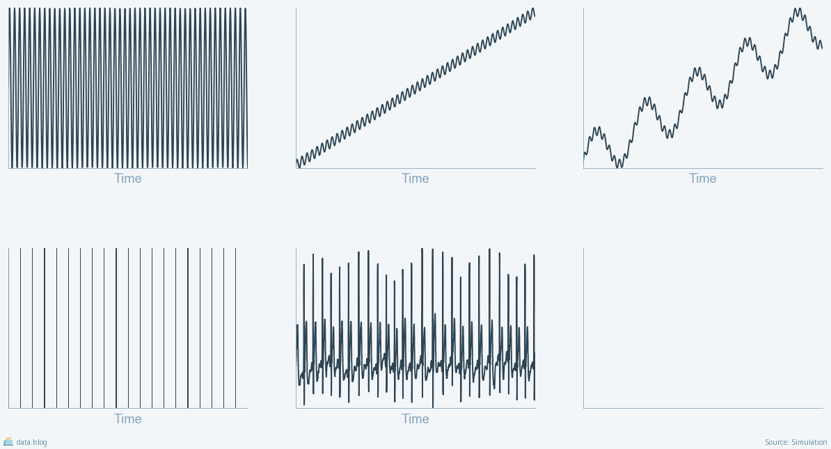
You might wonder what I was thinking when I declared this problem solved. After all, time series come in various shapes and types: seasonal fluctuations, trends, a combination of multiple seasons and a trend, binary series, complex series such as an electrocardiogram, you name it. Plus, every type of time series can have various anomaly types: sudden changes in several values — in the period size or the amplitude — to name a few. Besides, real‑life data sources can be influenced by malicious users, are prone to concept drift, and over- or under‑saturation of the measurements. All these factors make time series analysis a very complex task. Why, then, was I so sure that the solution would be simple?
The simplicity ladder
The truth is that in Automattic’s case, most of the complicating factors are either irrelevant or negligible. Recall that this project deals with the financial data of Automattic. Thus, it is very unlikely to be affected by malicious users. Automattic is a big enough company that sells services that are not affected by immediate external events. This means that the financial data is relatively stable. Stable data dynamics means simple modeling and even easier anomaly detection. The only challenges that I could not ignore were multiple seasonalities and concept drift.
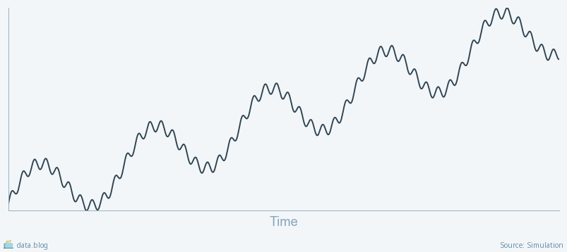
Multiple seasonality is a situation where a data series fluctuates as a function of two different cycles. For example, when speaking about sales of WordPress.com Premium Plans, one would expect some fluctuation during the business day, another fluctuation period during the week, and yet another dependent on the time of the year.
Multiple seasonality is indeed a serious challenge. However, we can mitigate it by trimming the resolution and the history size. By only analyzing the data at the daily resolution, we will ignore the differences during the day; and by limiting the history of the model to several weeks, we will only see daily fluctuations over the work week.
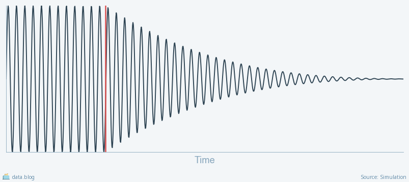
Concept drift is a phenomenon of gradual changes in the statistical properties of a variable. Naturally, such a drift poses new challenges to the modeler. However, the same measures that we take to deal with multiple seasonality are also able to minimize the concept drift problem.
Let me recap the current situation. By making reasonable assumptions about the data, and limiting the scope of our analysis, we ended up analyzing a relatively easy problem: a set of non‑interacting time‑dependent variables with a linear trend, and a single seasonal period.
There are numerous methods that we can use for this issue. One such method is called autoregressive integrated moving average (ARIMA). Using this approach, we use statistical analysis to separate a time series into a seasonal and non‑seasonal component. Many textbooks teach ARIMA as the first method to analyze time series. I hoped to be able to use it for my problem.
The hole is deeper than I thought
Unfortunately, I was too optimistic. According to my plan, I would fit a model to the actual data, compute the differences between the observed and predicted values, analyze the distribution of these differences (also called “residuals”), and treat the points with the highest deviation from the model as anomalies.

Recall that I decided to use ARIMA to model the data. During the modeling process, we combine the ARIMA equation and the observed data to obtain the equation parameters. Frequently, obtaining the correct parameters requires heavy custom‑tailored data preprocessing. Otherwise, the process will result in a nonsense model.
I was prepared to perform this preprocessing for a dozen dashboard metrics. What I forgot was the fact that each dashboard metric can be sliced and diced into a myriad of components — according to various business units and geographical areas. In this situation, we have hundreds, if not thousands of potential metrics, which means that manual fitting is out of the question.
Light at the end of the tunnel
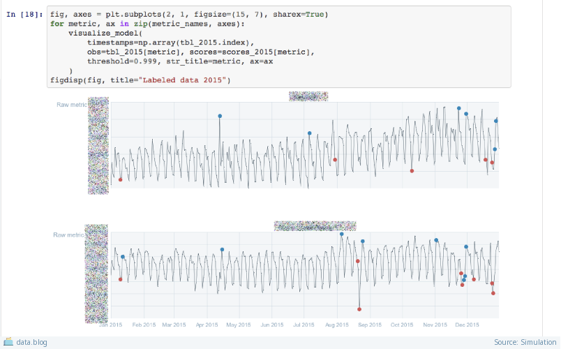
At this point, I had three choices. I could have limited myself to the primary metrics, hoping for the best. I didn’t like this option. I could automate the parameter fitting process using a series of smart heuristics. This option seemed like the “right one,” but it would require a long development process. The third option was to search for a “one tool fits all” solution. I was very fortunate to find a python package called seasonal, which was exactly the solution I was looking for. This package decomposes time series into the trend and seasonal components in a very robust manner. The combination of this robustness with the assumptions made earlier meant that I could obtain a reasonable model for any metric I wanted to. Surely, this universal nature comes at the cost of accuracy, but it was “good enough” for all my practical needs. I was happy again. All I had to do was to summarize the results in a nice Jupyter notebook and find a catchy name. That’s how a2f2 (anomaly analysis & future forecast) was born.

Overall, thanks to the many assumptions, the modeling part of the project took one week. This includes data collection, experimentation, coding, and parameter selection. Interestingly, it took three more months to bring a2f2 to the point where its output is valued and required by the relevant “customers” in the company. During these three months, we’ve built a framework that includes a REST API, interactive visualization, and periodic jobs that push anomaly alters to subscribers. This is a topic for an additional story, which I told during the last PyCon Israel conference. Here is the slide deck from my a2f2 presentation.
When good enough is NOT good enough
Is the resulting solution the best we can do? Certainly not! Currently, its biggest problem is too many false positives due to an inability to ignore deviations that are “too small to care” from a business point of view. Also, a2f2 can’t forecast metrics with complex or somewhat erratic dynamics. However, it is indeed good enough. It is good enough to provide valuable and relevant information to the company’s business people. It is good enough to justify more development.
Make no mistakes. By itself, a2f2 wasn’t good enough to justify additional developmental resources. It was the framework around the model (visualization, web server, periodic alerts) that triggered the interest in a2f2. A stand‑alone model is only good enough for the modeler — the person with intimate knowledge of the numbers and the model. If there’s one thing that I’ve learned from this project is that other people just want to have their jobs done and don’t care about your modeling efforts. That is why delivering a solution is much more important that refining the method. Essentially, I’ve rediscovered the Minimal Viable Product approach.
Libraries mentioned in the talk
- Bokeh an excellent data visualization library. It allows you to create interactive charts in the browser writing only Python code.
- Seasonal is a library for robust estimation of trend and periodicity in time series data. This library saved me hours of hard work.
- Bottle is a lean web framework for Python. I built my first web server during this project and I found Bottle functionality and documentation very useful. Integrating between Bokeh charts and Bottle was pretty easy, as well.


Leave a comment