Default:

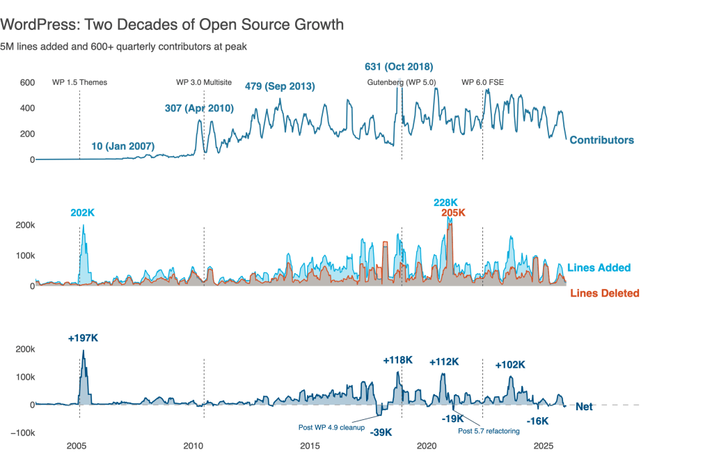
Delightful:

The same data. The same library. Five prompts and a couple of visualization principles transformed one into the other.
I can never remember the exact syntax for Plotly. Or Matplotlib. Or any other visualization library.
That used to mean choosing between two poor options: wrestle with documentation, or settle for drag‑and‑drop tools that can’t do what I actually want.
AI changes this. Now I describe what I want in plain language, iterate through ideas in conversation, and let the model handle the boilerplate. I focus on the design while AI handles the API.
This post walks through that process. I used Claude and Plotly, but the approach works with any capable coding assistant visualization library. Starting from defaults and progressively applying data visualization best practices, all through natural language prompts. The complete code is available on GitHub.
The data is the WordPress.org open source project code changes history (2003–2025), tracking contributors and lines of code changed.
WordPress credits contributors via “Props” tags in commit messages—crediting not just committers, but reviewers, testers, bug reporters, and patch authors. “Contributors” means everyone credited via Props.
Iteration 0: Raw Weekly Data Won’t Work
Raw weekly data is useful for operational monitoring, but not so effective for storytelling. Single large commits create spikes. Holidays create gaps. The signal gets lost in noise.
A 12‑week rolling window smooths this noise, revealing sustained patterns rather than one‑off events. Now we can see trends and tell a story.
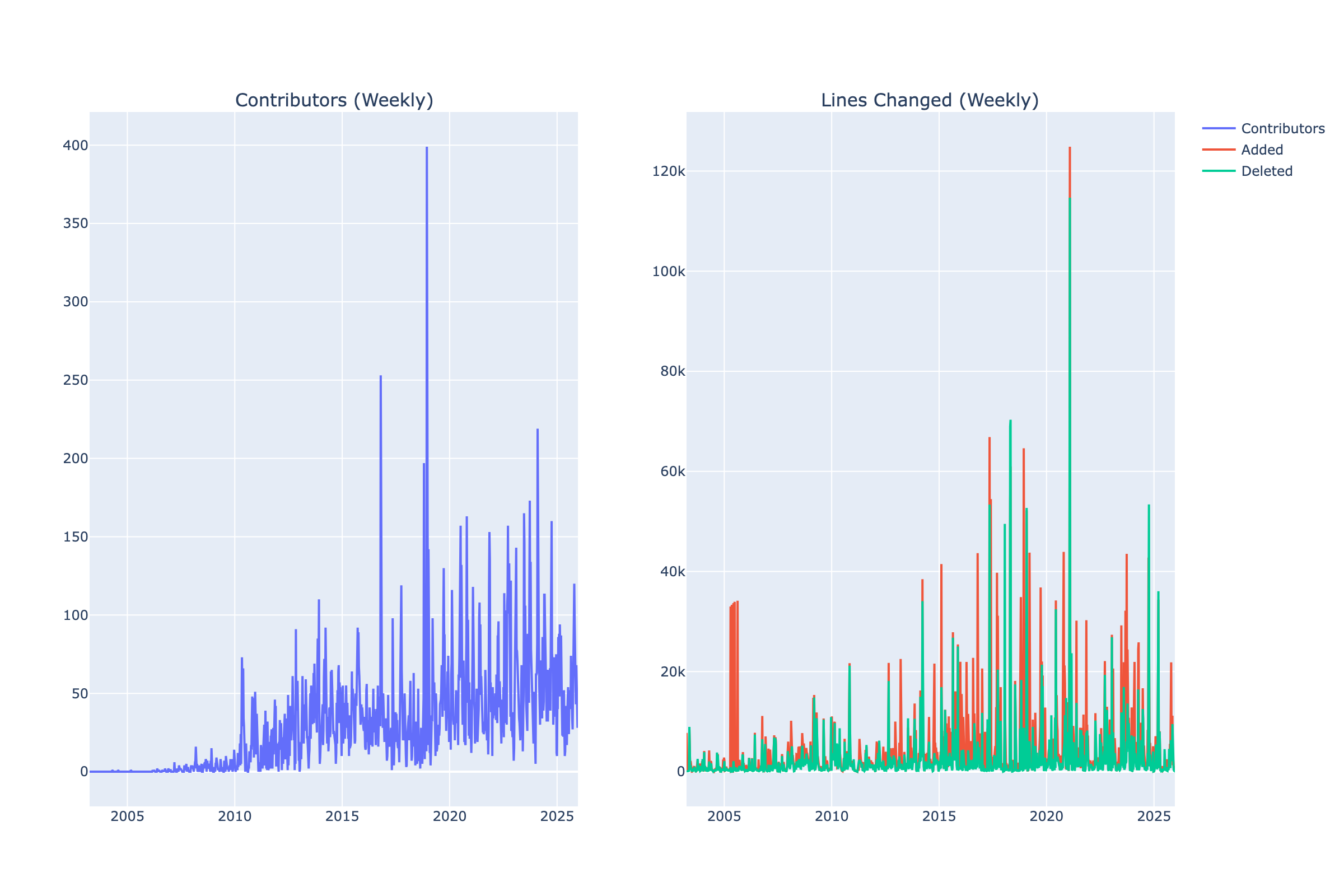
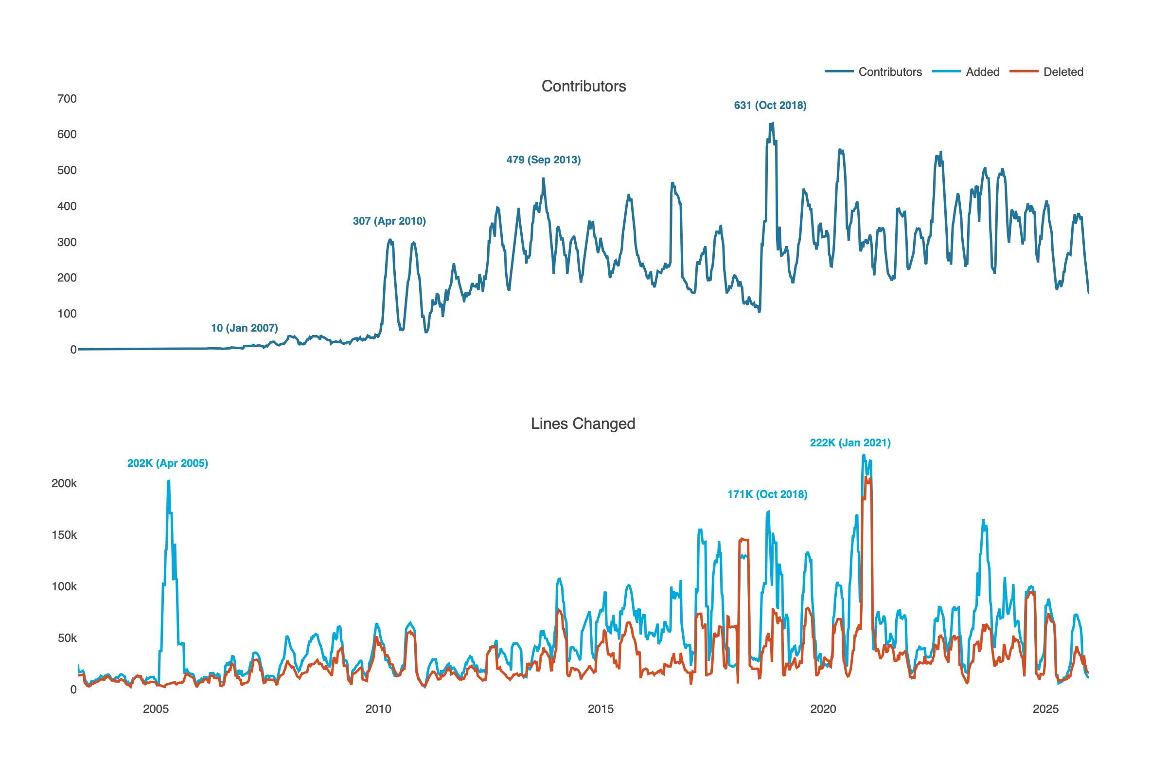
Iteration 1: Plotly Defaults
AI Prompt: “Create line charts showing contributors over time in one chart, and lines added and deleted in a second chart.”
This is what Plotly gives us out of the box.
What’s wrong with the defaults?
- No title.
- Generic axis labels (just column names).
- Cluttered background with dark gridlines.
- Default colors don’t tell a story.
- Legend placement takes up space.
- No context about what the data means.
Let’s improve this, step‑by‑step.
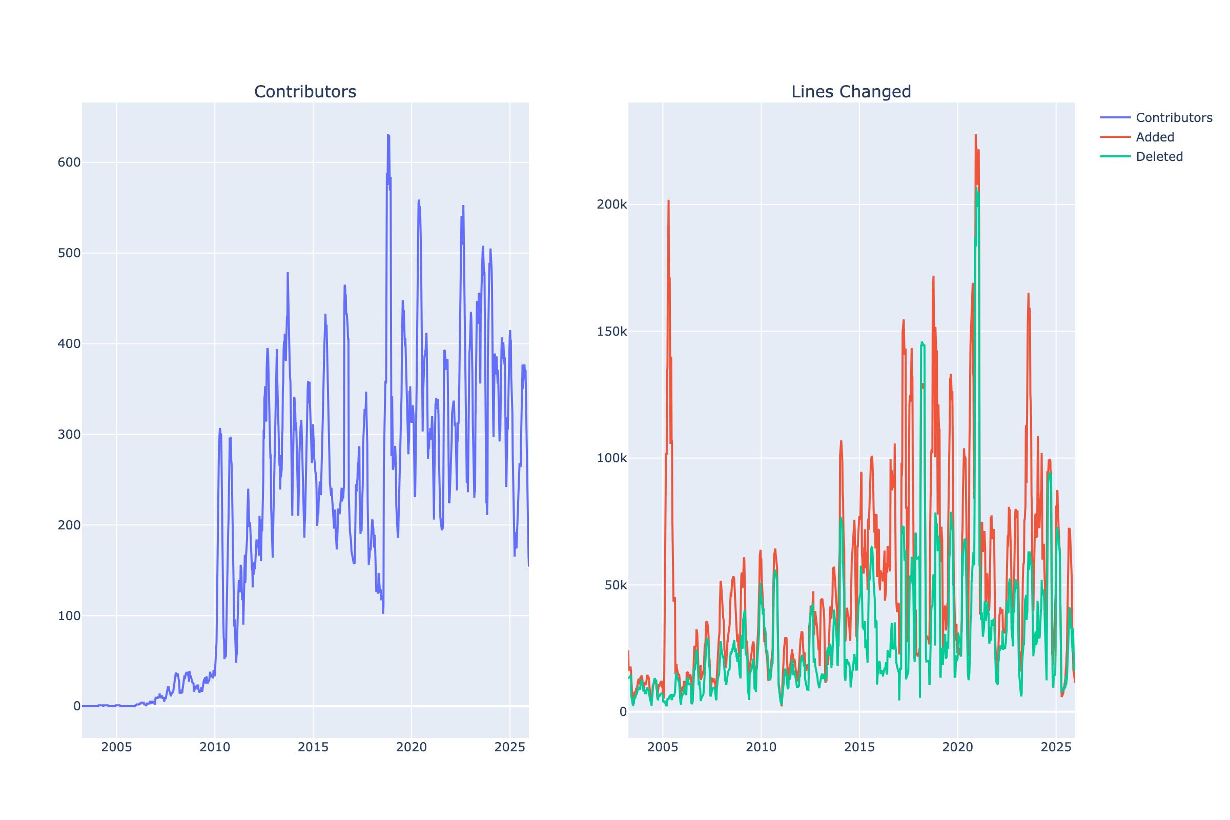
Iteration 2: Declutter and Structure
AI Prompt: “Clean up these charts by removing visual clutter. Make the background white, reduce gridline prominence. Draw the charts in 2 rows instead of 2 columns, so the x‑axis is shared.”
What has improved?
- White background removes visual noise.
- Subtle gridlines guide the eye without distraction.
- Vertical stacking aligns time axes for easy comparison.
- Shared x‑axis makes temporal comparison intuitive.
- Semantic colors: green for growth, red for removal. The metaphor is immediate. Previous defaults were misleading.
Better. But still generic. Let’s make it WordPress.
Iteration 3: WordPress Brand Colors, No Gridlines, Peak Annotations
AI Prompt: “Apply official WordPress.org brand colors and remove gridlines completely for a cleaner look. Add inline annotations showing the peak number of contributors at key intervals so the viewer can see the growth trajectory without needing to trace to the y‑axis.”
What has improved?
- WordPress brand colors and typography create a visual identity.
- Gridlines removed for a cleaner, less cluttered look.
- Peak annotations with dates show growth trajectory. The reader can see exact values and timing.
Now the chart communicates identity and trajectory. But there’’s a story hiding in the data that we haven’t shown yet: what happens when code gets deleted?
Iteration 4: Add Net Growth Panel with Area Fills
AI Prompt: “Add net code growth as a third panel. Use area fills to show magnitude more clearly. Add inline labels to all charts. Remove the legend. Left‑align titles. Make all the text 50% larger.”
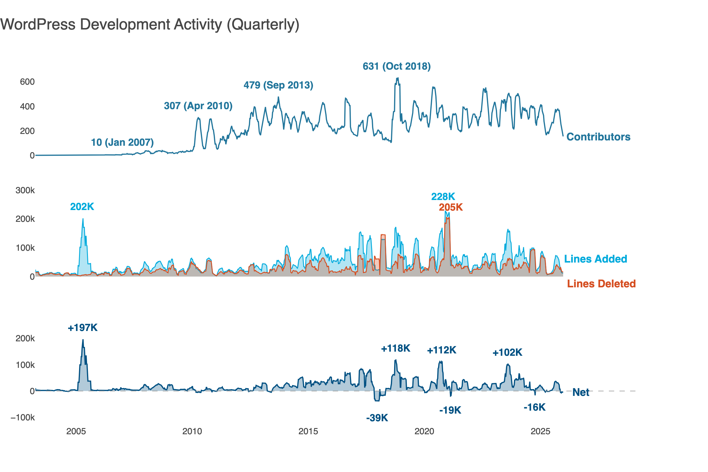
What has improved?
- Three panels show contributors, code churn, and net growth. Three dimensions of project health, visible at once.
- Area fills show magnitude more clearly than lines alone. You feel the difference between 50K lines and 200K lines.
- Net growth panel shows when WordPress grew vs churned code. The dips below zero are cleanup. Major releases often trigger refactoring: paying down technical debt, removing deprecated code.
- Inline labels replace the legend for a cleaner look.
- The peaks tell a story: 2005 (+197K) marks WordPress 1.5’s expansion, 2017 (‑39K) shows post‑release cleanup, and 2018 (+118K) is Gutenberg’s arrival.
We’re close. The data is clear, the design is clean. But we’re still showing what happened. Let’s tell the reader what it means.
Iteration 5: Add Storytelling
AI Prompt: “Transform this from a data display into a data story. Add a takeaway title that states the key insight. Remove chart titles since inline labels provide context. Add WordPress milestone annotations.”
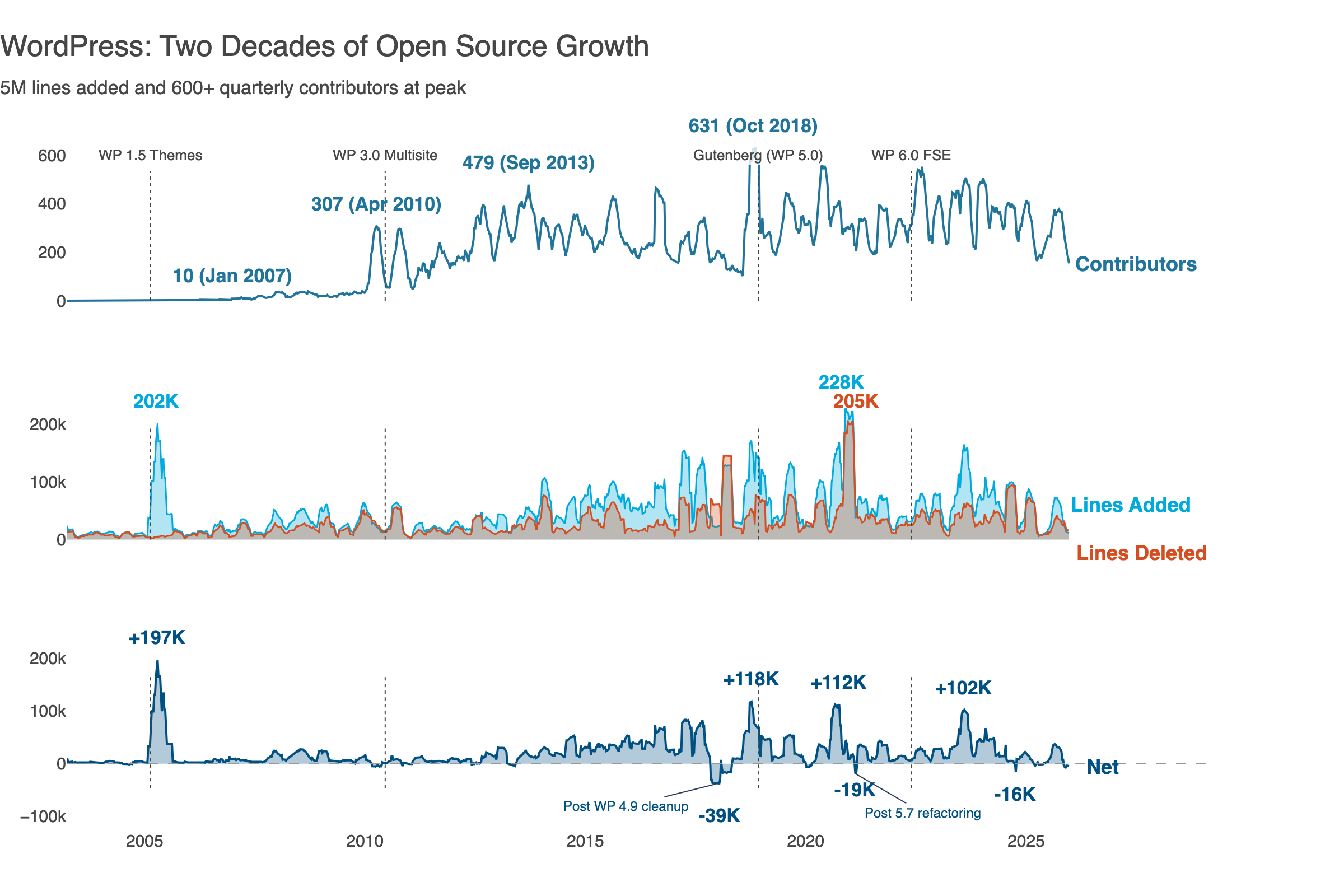
The title now tells something beyond being descriptive. The milestone annotations (WP 1.0, WP 2.0, Gutenberg) give readers orientation. We see a project’s evolution, not just lines. The negative net growth periods are a healthy codebase breathing: expanding with new solutions, contracting with cleanup.
That’s the story. Here’s how an open source project grows, matures, and sustains itself.
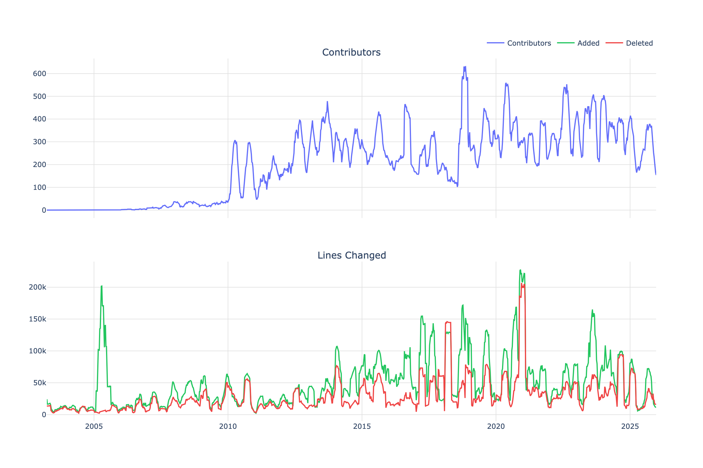
The Complete Transformation
Compare Iteration 1 (Plotly defaults) with Iteration 5 (storytelling):
| Aspect | Before | After |
| Title | Generic subplot labels | Insight-driven headline |
| Colors | Random defaults | WordPress brand palette |
| Legend | External box | Inline labels at line ends |
| Context | None | Milestone annotations |
| Layout | Side-by-side | Vertically aligned, shared x-axis |
| Chart titles | Generic | Removed (inline labels suffice) |
| Message | “Here’s data” | “Here’s what the data means” |
The same data tells a different story when presented effectively.
The barrier used to be technical: you needed to know library APIs, fight with positioning code, and remember obscure parameters. Now you describe what you want and iterate in conversation. The AI handles syntax; you handle meaning.
This shifts the valuable skill. Memorizing fig.update_layout() parameters matters less. What matters more is why to remove gridlines, when to use area fills, and how to write a takeaway title.
Data visualization best practices haven’t changed. But now anyone can apply them.
Built with Claude, Plotly, and marimo. Full code and data pipeline can be found at github.com/gelbal/repo‑history‑analyze.
Thanks to Shannon and Jeffrey for the reviews and suggestions!


Leave a comment